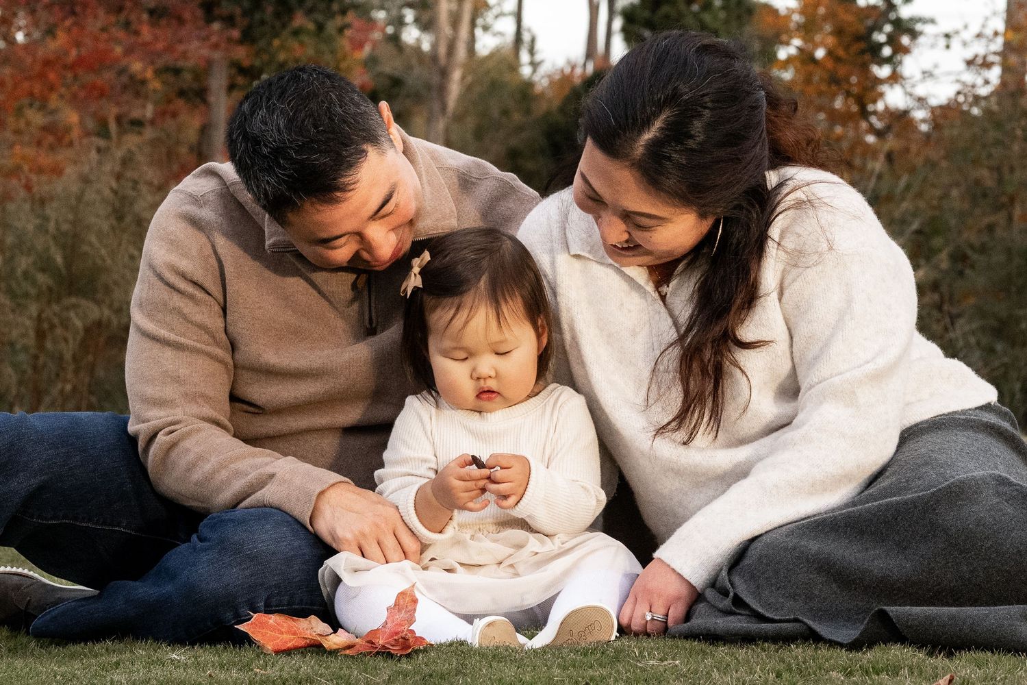
Every photo tells a story — and what you wear becomes part of that story. At Seth Baird Photography, I believe great portraits start long before you step in front of the camera. Choosing the right outfits helps bring out your personality, your connection, and the natural style that makes your images feel timeless. Whether you’re planning a family session or a couples shoot, this guide will help you coordinate looks that feel effortless, genuine, and true to you — any time of year.
When it comes to clothing, the goal isn’t to match perfectly — it’s to complement one another. The most memorable photos come from real connection and relaxed confidence, not stiff, overly planned outfits. A few simple guidelines around color, texture, and coordination can make all the difference in how your images come to life.
Let’s start with the foundation — choosing a color palette that fits your setting and season.
1. Choose a Coordinated Color Palette
Start by choosing two to three colors that naturally blend well together. Think of your palette as a direction, not a rule. The goal isn’t to limit your choices — it’s to create flow and balance so the focus stays on your connection rather than competing tones.
Leaning toward colors that complement one another helps everything in the final image work together — skin tones, background, and lighting. You can absolutely include personal touches and favorite shades within that range; variation adds depth and personality while still keeping a cohesive look.
Below are a few seasonal color palettes that tend to photograph beautifully year-round, offering inspiration — not boundaries — for your session’s overall feel:

Warm Neutrals
(Timeless for any season — flattering in fields, downtown settings, or lakesides)
Cream | Camel | Rust | Olive | Soft Denim
Warm neutrals are versatile and forgiving — they work beautifully in almost any setting and pair naturally with soft lighting. You can adjust this palette easily by adding your own accent colors or textures for a personal touch.

Earthy & Muted
(Perfect for spring greens, wooded areas, or soft morning light)
Sage Green | Oatmeal | Dusty Rose | Brown
These soft, natural tones bring an organic feel that complements the outdoors and soft light. You can mix lighter or darker versions of these shades — the idea is to stay within a gentle, natural range rather than exact matches.

Classic Contrast
(Ideal for cooler seasons or sessions with bold scenery and architecture)
Navy | Mustard | Maroon | Ivory | Forest Green
This palette adds depth and drama without feeling overpowering. It’s great if you love a bit more color in your images — just balance bold tones with neutrals or softer fabrics to keep the focus on connection and expression.
2. Focus on Texture and Layers
Texture adds depth and visual interest to your photos without relying on bold patterns or bright colors. Choose materials that catch light softly — like knits, linen, corduroy, or denim. Mixing a few textures within your group brings richness and a natural feel, especially in outdoor light.
Layers create flexibility and variety. A cardigan, scarf, or jacket can subtly change the look of a photo without requiring a full outfit swap. They also help you adjust comfortably to shifts in temperature or light — especially helpful for outdoor sessions or families with kids.
For couples, layering adds connection and visual balance between your looks — a shared tone or fabric can tie your outfits together naturally. For families, focus on soft transitions rather than identical styles. The goal is harmony, not uniformity.
3. Coordinate, Don’t Match
The goal isn’t to match — it’s to complement. When each outfit connects through tone or texture, the whole image feels cohesive without anyone blending into the background.
If one person wears a pattern (like plaid, floral, or subtle stripes), pull solid colors from that pattern for the other outfits. This approach keeps everything balanced and natural — not overly styled or staged.
Example: if one person wears a floral dress with sage and rust tones, their partner might choose a neutral shirt with tan pants, while the kids wear coordinating solids in cream and olive.
Think of your clothing as a team effort — different roles, same story. Everyone brings a bit of personality, but together it all works in harmony.
4. Keep It Comfortable and True to You
Your clothing should feel like you. Choose pieces that fit well, move easily, and reflect your personality. Sessions often include walking, sitting, or playing — and genuine smiles come naturally when everyone feels relaxed.
5. Avoid Distractions
Keep the focus on connection — not clothing. Bright whites, neon colors, and large logos can pull attention away from faces and the emotion in your photos.
Stick with soft neutrals and natural tones that complement your surroundings and skin tones. Subtle, timeless colors — like beige, sage, navy, or cream — tend to photograph beautifully in almost any setting.
If you love a pop of color, use it intentionally — a scarf, dress, or jacket in a rich tone can add personality without overwhelming the image. The goal is for your clothing to support the story, not compete with it.
6. Review Outfits in Advance
Plan ahead so your looks feel cohesive on camera. If family members or partners are choosing outfits separately, share quick photos in a group text or shared album before your session.
Seeing everything side by side helps you spot colors that clash or blend too closely, and ensures a balanced mix of tones, patterns, and textures.
Aim for variation within the same story. Not everyone needs to wear the same shade — in fact, subtle differences in color and texture make your images feel more natural and layered.
A quick review before session day gives everyone confidence, saves time, and helps your final images look intentional and seamless.
7. Consider the Setting
Your location sets the tone for your entire session. It influences the light, colors, and overall mood of your images — and when your wardrobe aligns with your environment, everything feels cohesive and intentional.
Think about the story you want your images to tell. Do you want something warm and natural, modern and bold, or soft and relaxed? The setting should reflect your personality and connection, not just the scenery.
A few quick guidelines to help match your outfits with the environment:
• Outdoors: Earth tones, soft neutrals, and natural fabrics blend beautifully with open fields, wooded trails, or garden spaces.
• Urban: Bold contrast, layers, and structured textures (like denim or leather) complement clean lines, brick, and city architecture.
• Beach or Lakeside: Light colors, airy fabrics, and soft movement create a relaxed, timeless feel that pairs perfectly with water and sky.
When your clothing complements your surroundings, the image flows effortlessly. It’s less about “fitting in” and more about belonging naturally to the space.
If you’re still deciding where to shoot, take a look at my guide on How to Choose the Perfect Setting for Your Photo Session — it explores how location, light, and texture work together to shape the final look and feel of your photos.
